Dialog
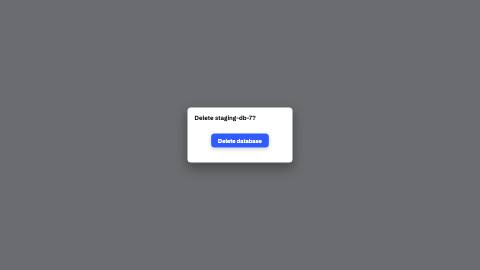
Modal that opens with an overlay fade and a 0.95→1 popup scale, capped by the safe zone so it never bleeds off-screen in portrait.
Installation
npx shadcn add https://www.reelcn.dev/r/dialog.jsonFiles land in src/reelcn/ with the items it builds on. Dependencies: remotion.
Usage
<Dialog id="confirm" title="Delete staging-db-7?" steps={[{ at: 0, state: "closed" }, { at: 0.5, state: "open" }]} place={{ x: 50, y: 50 }}>
  <Button id="submit" label="Delete database" variant="primary" place={{ x: 50, y: 60 }} />
</Dialog>
Props
PropTypeDescription
delaynumberFrames to wait before entering.
durationnumberEnter duration in frames. Defaults to 0.6s. Some items reuse
duration for an unrelated local timing. See that item's own prop docs.exitnumber | booleanExit at the end of the parent `<Sequence>`.
false keeps it on screen, a number sets the exit length in frames.motionMotionPersonalityOverride the theme's motion personality.
posterbooleanRenders fully entered, with no exit: for a still frame or thumbnail. Defaults to
false.holdFramesnumberDelays the start of the exit window by this many frames, for a minimum on-screen hold. Defaults to
0.idstring
stepsStep<"closed" | "open">[]
title*string
childrenReactNode
placePlace
styleCSSProperties
classNamestring
Built from
Use
- A confirmation or form modal in a UI-sim walkthrough, composing `button`/`input` as its body
- A `ui` scene's `component: "dialog"`
Avoid
- A modal with no real content. Use
callout
Guides
Components take their colors from a theme, their timing from motion props and their layout from the canvas.
Source
registry/items/dialog.tsx
/**
 * @title Dialog
 * @category product
 * @description Modal that opens with an overlay fade and a 0.95→1 popup scale, capped by the safe zone so it never bleeds off-screen in portrait.
 * @duration data-driven
 * @use A confirmation or form modal in a UI-sim walkthrough, composing `button`/`input` as its body
 * @use A `ui` scene's `component: "dialog"`
 * @avoid A modal with no real content. Use `callout`
 * @tags dialog, modal, popup, ui, kit
 * @example
 * <Dialog id="confirm" title="Delete staging-db-7?" steps={[{ at: 0, state: "closed" }, { at: 0.5, state: "open" }]} place={{ x: 50, y: 50 }}>
 *   <Button id="submit" label="Delete database" variant="primary" place={{ x: 50, y: 60 }} />
 * </Dialog>
 */
import type React from "react";
import { AbsoluteFill } from "remotion";
import {
  Center,
  type MotionProps,
  type Place,
  type Step,
  useKeyframeState,
  useMotion,
  useTheme,
  useViewport,
} from "./core";
import type { AnchorRect } from "./core-math";

export type DialogProps = MotionProps & {
  id?: string;
  steps?: Step<"closed" | "open">[];
  title: string;
  children?: React.ReactNode;
  place?: Place;
  style?: React.CSSProperties;
  className?: string;
};

export const POPUP_WIDTH = 420;
export const POPUP_HEIGHT = 220;
const PAD = 28;

/** Pure: capped by the safe zone: shared by `useDialogAnchors`, `Dialog` and the `ui` scene (Task 9),
 * ponytail-review blocker 2's "one formula" contract. */
export function dialogBoxSize(u: (n: number) => number, canvasWidth: number, safeX: number) {
  return { width: Math.min(u(POPUP_WIDTH), canvasWidth - safeX * 2), height: u(POPUP_HEIGHT) };
}

export function useDialogAnchors(props: DialogProps): Record<string, AnchorRect> {
  const { u, width, height, safe } = useViewport();
  if (!props.id || !props.place) return {};
  const { width: w, height: h } = dialogBoxSize(u, width, safe.x);
  const wPct = (w / width) * 100;
  const hPct = (h / height) * 100;
  return { [props.id]: { x: props.place.x - wPct / 2, y: props.place.y - hPct / 2, width: wPct, height: hPct } };
}

export function Dialog({ id: _id, steps, title, children, place, style, className, ...motion }: DialogProps) {
  const theme = useTheme();
  const { u, width, safe } = useViewport();
  const m = useMotion(motion);
  const { state, from, progress } = useKeyframeState<"closed" | "open">(steps, "closed");
  const fromOpen = from === "open" ? 1 : 0;
  const toOpen = state === "open" ? 1 : 0;
  const openAmount = Math.max(0, Math.min(1, fromOpen + (toOpen - fromOpen) * progress));
  // Same formula `useDialogAnchors` hands out as this dialog's anchor rect, the card's real box must
  // match it, or a child placed by `place` (a % of *this* box, per its own containing-block CSS) lands
  // against a height the card never actually reserves (T1: an auto-height card sized to the title alone
  // put a `place={{y:60}}` button on top of the title instead of below it).
  const { width: popupW, height: popupH } = dialogBoxSize(u, width, safe.x);

  return (
    <AbsoluteFill style={{ pointerEvents: openAmount > 0.02 ? "auto" : "none", opacity: m.presence }}>
      <AbsoluteFill style={{ background: theme.colors.shadow, opacity: openAmount * 0.6 }} />
      <Center>
        <div
          className={className}
          style={{
            position: place ? "absolute" : "relative",
            left: place ? `${place.x}%` : undefined,
            top: place ? `${place.y}%` : undefined,
            translate: place ? "-50% -50%" : undefined,
            width: popupW,
            height: popupH,
            padding: u(PAD),
            borderRadius: u(theme.radius),
            background: theme.colors.surface,
            boxShadow: `0 ${u(20)}px ${u(48)}px rgba(0,0,0,0.35)`,
            scale: String(0.95 + 0.05 * openAmount),
            opacity: openAmount,
            ...style,
          }}
        >
          <div
            style={{
              color: theme.colors.foreground,
              fontFamily: theme.fonts.heading,
              fontWeight: theme.headingWeight,
              fontSize: u(24),
              marginBottom: u(18),
            }}
          >
            {title}
          </div>
          {children}
        </div>
      </Center>
    </AbsoluteFill>
  );
}