Highlight
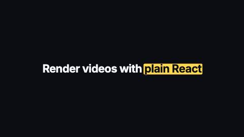
Sentence with one phrase emphasized by a marker sweep, a hand-drawn underline or circle, or an outlined box.
Highlight, marker
Installation
npx shadcn add https://www.reelcn.dev/r/highlight.jsonFiles land in src/reelcn/ with the items it builds on. Dependencies: remotion.
Usage
<Center>
  <Highlight text="Render videos with plain React" highlight="plain React" variant="marker" />
</Center>
Props
PropTypeDescription
delaynumberFrames to wait before entering.
durationnumberEnter duration in frames. Defaults to 0.6s. Some items reuse
duration for an unrelated local timing. See that item's own prop docs.exitnumber | booleanExit at the end of the parent `<Sequence>`.
false keeps it on screen, a number sets the exit length in frames.motionMotionPersonalityOverride the theme's motion personality.
posterbooleanRenders fully entered, with no exit: for a still frame or thumbnail. Defaults to
false.holdFramesnumberDelays the start of the exit window by this many frames, for a minimum on-screen hold. Defaults to
0.textstringRequired unless
target is given. Default "".highlightstringPhrase inside
text to emphasize (first match, any case). It never wraps, so keep it short. Required unless target is given. Default "".target{ anchors: Record<string, AnchorRect>; id: string; }A kit anchor's rect to highlight instead of a text phrase. Only with `variant: "box"` or `"circle"` (no text to flow
marker/underline around).variantHighlightVariant Default
"marker".sizenumberFont size in design units. Default
88.weightnumber
font"mono" | "heading" | "body" Default
"heading".colorstringSentence color. Defaults to the theme foreground.
highlightColorstringMarker, line and box color. Defaults to the theme highlight.
highlightTextColorstringPhrase color on top of the marker. Defaults to the theme foreground or background, whichever reads better.
align"left" | "right" | "center" Default
"center".dimRestbooleanFade the rest of the sentence as the mark draws, so the phrase is the only thing left in focus. Default
false.styleCSSProperties
classNamestring
Built from
Use
- Calling out the key phrase in a quote, claim or hook
- Tutorial titles that point at a single term
Avoid
- Cycling through several words in one slot. Use
word-rotator
Guides
Components take their colors from a theme, their timing from motion props and their layout from the canvas.
Source
registry/items/highlight.tsx
/**
 * @title Highlight
 * @category text
 * @description Sentence with one phrase emphasized by a marker sweep, a hand-drawn underline or circle, or an outlined box.
 * @duration 30
 * @use Calling out the key phrase in a quote, claim or hook
 * @use Tutorial titles that point at a single term
 * @avoid Cycling through several words in one slot. Use `word-rotator`
 * @tags marker, underline, circle, box, emphasis, annotate
 * @example
 * <Center>
 *   <Highlight text="Render videos with plain React" highlight="plain React" variant="marker" />
 * </Center>
 */
import type React from "react";
import { AbsoluteFill } from "remotion";
import {
  type AnchorRect,
  type MotionProps,
  requireAnchor,
  StrokeOverlay,
  tween,
  useMotion,
  useTheme,
  useViewport,
} from "./core";

export type HighlightVariant = "marker" | "underline" | "strike" | "box" | "circle";

export type HighlightProps = MotionProps & {
  /** Required unless `target` is given. */
  text?: string;
  /** Phrase inside `text` to emphasize (first match, any case). It never wraps, so keep it short. Required unless `target` is given. */
  highlight?: string;
  /** A kit anchor's rect to highlight instead of a text phrase. Only with `variant: "box"` or `"circle"` (no text to flow `marker`/`underline` around). */
  target?: { anchors: Record<string, AnchorRect>; id: string };
  variant?: HighlightVariant;
  /** Font size in design units. */
  size?: number;
  weight?: number;
  font?: "heading" | "body" | "mono";
  /** Sentence color. Defaults to the theme foreground. */
  color?: string;
  /** Marker, line and box color. Defaults to the theme highlight. */
  highlightColor?: string;
  /** Phrase color on top of the marker. Defaults to the theme foreground or background, whichever reads better. */
  highlightTextColor?: string;
  align?: "left" | "center" | "right";
  /** Fade the rest of the sentence as the mark draws, so the phrase is the only thing left in focus. */
  dimRest?: boolean;
  style?: React.CSSProperties;
  className?: string;
};

/** Hand-drawn strokes, stretched over the phrase. Underline box is 100×20, circle box 100×40. */
const UNDERLINE = "M2 13 C 24 7, 58 6, 98 9";
const STRIKE = "M2 11 C 30 8, 66 12, 98 8";
const CIRCLE = "M78 5 C 55 0, 16 2, 5 14 C -3 26, 20 38, 52 37 C 84 36, 100 27, 96 15 C 92 5, 64 1, 36 6";

/** WCAG relative luminance of a #rgb or #rrggbb color; null for any other CSS color. */
function luminance(color: string): number | null {
  const match = /^#([0-9a-f]{3}|[0-9a-f]{6})$/i.exec(color.trim());
  if (!match) return null;
  const hex = match[1].length === 3 ? match[1].replace(/./g, "$&$&") : match[1];
  const channel = (offset: number) => {
    const value = Number.parseInt(hex.slice(offset, offset + 2), 16) / 255;
    return value <= 0.03928 ? value / 12.92 : ((value + 0.055) / 1.055) ** 2.4;
  };
  return 0.2126 * channel(0) + 0.7152 * channel(2) + 0.0722 * channel(4);
}

/** Whichever of `a` and `b` contrasts more with `background`; `a` when a color can't be parsed. */
function readableOn(background: string, a: string, b: string) {
  const base = luminance(background);
  const la = luminance(a);
  const lb = luminance(b);
  if (base === null || la === null || lb === null) return a;
  const contrast = (l: number) => (Math.max(l, base) + 0.05) / (Math.min(l, base) + 0.05);
  return contrast(la) >= contrast(lb) ? a : b;
}

export function Highlight({
  text = "",
  highlight = "",
  target,
  variant = "marker",
  size = 88,
  weight,
  font = "heading",
  color,
  highlightColor,
  highlightTextColor,
  align = "center",
  dimRest = false,
  style,
  className,
  ...motion
}: HighlightProps) {
  const theme = useTheme();
  const { u, width, height, safe } = useViewport();
  const m = useMotion(motion);
  const fontPx = u(size);
  const mark = highlightColor ?? theme.colors.highlight;
  // The mark starts drawing once the sentence has mostly arrived.
  const drawn = Math.min(
    Math.max(
      tween(m.frame, m.fps, {
        from: m.delay + Math.round(m.enterFrames * 0.6),
        duration: m.enterFrames,
        motion: m.preset,
      }),
      0,
    ),
    1,
  );
  const stroke = {
    fill: "none",
    stroke: mark,
    strokeWidth: fontPx * (variant === "box" ? 0.045 : 0.06),
    strokeLinecap: "round" as const,
    pathLength: 1,
    strokeDasharray: 1,
    strokeDashoffset: 1 - drawn,
    // A round cap on a fully offset dash still paints a dot; hide the stroke until it starts drawing.
    strokeOpacity: drawn > 0 ? 1 : 0,
  };

  if (target) {
    if (variant !== "box" && variant !== "circle") {
      throw new Error(
        'Highlight: "target" needs variant "box" or "circle" (marker/underline have no rect to draw around)',
      );
    }
    const rect = requireAnchor(target.anchors, target.id, "Highlight");
    const pad = u(16);
    const left = (rect.x / 100) * width - pad;
    const top = (rect.y / 100) * height - pad;
    const w = (rect.width / 100) * width + pad * 2;
    const h = (rect.height / 100) * height + pad * 2;
    return (
      <AbsoluteFill className={className} style={{ opacity: m.presence, ...style }}>
        <svg
          aria-hidden="true"
          viewBox={variant === "circle" ? "0 0 100 40" : undefined}
          preserveAspectRatio={variant === "circle" ? "none" : undefined}
          style={{ position: "absolute", left, top, width: w, height: h, overflow: "visible" }}
        >
          {variant === "box" ? (
            <rect width="100%" height="100%" rx={Math.min(u(theme.radius), Math.min(w, h) * 0.2)} {...stroke} />
          ) : (
            <StrokeOverlay
              d={CIRCLE}
              kind={theme.stroke}
              seed="highlight-circle-target"
              color={mark}
              strokeWidth={fontPx * 0.06}
              drawn={drawn}
              extraProps={{ vectorEffect: "non-scaling-stroke", strokeLinecap: "round" }}
            />
          )}
        </svg>
      </AbsoluteFill>
    );
  }

  const at = highlight ? text.toLowerCase().indexOf(highlight.toLowerCase()) : -1;
  // Matched case-insensitively; the mark shows the phrase as written in `text`.
  const phrase = at < 0 ? "" : text.slice(at, at + highlight.length);

  const rest: React.CSSProperties | undefined = dimRest ? { opacity: 1 - 0.55 * drawn } : undefined;
  const overlay: React.CSSProperties = { position: "absolute", overflow: "visible", pointerEvents: "none" };

  const markFor = (phrase: string) => {
    switch (variant) {
      case "marker":
        // A copy of the phrase in a contrasting color rides on the band, so dark text never sits on a dark canvas.
        return (
          <span
            style={{
              ...overlay,
              top: 0,
              bottom: 0,
              left: "-0.08em",
              right: "-0.08em",
              padding: "0 0.08em",
              clipPath: `inset(0 ${(1 - drawn) * 100}% 0 0)`,
            }}
          >
            <span
              style={{
                position: "absolute",
                inset: "0.14em 0 0.04em",
                background: mark,
                borderRadius: Math.min(u(theme.radius), fontPx * 0.12),
              }}
            />
            <span
              style={{
                position: "relative",
                color: highlightTextColor ?? readableOn(mark, theme.colors.foreground, theme.colors.background),
              }}
            >
              {phrase}
            </span>
          </span>
        );
      case "underline":
        return (
          <svg
            aria-hidden="true"
            viewBox="0 0 100 20"
            preserveAspectRatio="none"
            style={{ ...overlay, left: "-0.06em", top: "0.9em", width: "calc(100% + 0.12em)", height: "0.32em" }}
          >
            <StrokeOverlay
              d={UNDERLINE}
              kind={theme.stroke}
              seed="highlight-underline"
              color={mark}
              strokeWidth={fontPx * 0.06}
              drawn={drawn}
              extraProps={{ vectorEffect: "non-scaling-stroke", strokeLinecap: "round" }}
            />
          </svg>
        );
      case "strike":
        return (
          <svg
            aria-hidden="true"
            viewBox="0 0 100 20"
            preserveAspectRatio="none"
            style={{ ...overlay, left: "-0.08em", top: "0.42em", width: "calc(100% + 0.16em)", height: "0.3em" }}
          >
            <StrokeOverlay
              d={STRIKE}
              kind={theme.stroke}
              seed="highlight-strike"
              color={mark}
              strokeWidth={fontPx * 0.1}
              drawn={drawn}
              extraProps={{ vectorEffect: "non-scaling-stroke", strokeLinecap: "round" }}
            />
          </svg>
        );
      case "circle":
        return (
          <svg
            aria-hidden="true"
            viewBox="0 0 100 40"
            preserveAspectRatio="none"
            style={{ ...overlay, left: "-0.3em", top: "-0.12em", width: "calc(100% + 0.6em)", height: "1.45em" }}
          >
            <StrokeOverlay
              d={CIRCLE}
              kind={theme.stroke}
              seed="highlight-circle"
              color={mark}
              strokeWidth={fontPx * 0.06}
              drawn={drawn}
              extraProps={{ vectorEffect: "non-scaling-stroke", strokeLinecap: "round" }}
            />
          </svg>
        );
      case "box":
        return (
          <svg
            aria-hidden="true"
            style={{ ...overlay, left: "-0.16em", top: "0.04em", width: "calc(100% + 0.32em)", height: "1.1em" }}
          >
            <rect width="100%" height="100%" rx={Math.min(u(theme.radius), fontPx * 0.2)} {...stroke} />
          </svg>
        );
    }
  };

  return (
    <div
      className={className}
      style={{
        fontFamily: theme.fonts[font],
        fontSize: fontPx,
        fontWeight: weight ?? (font === "heading" ? theme.headingWeight : 500),
        color: color ?? theme.colors.foreground,
        lineHeight: 1.15,
        letterSpacing: font === "mono" ? 0 : "-0.025em",
        textAlign: align,
        textWrap: "balance",
        maxWidth: width - safe.x * 2,
        opacity: m.presence,
        translate: `0 ${(1 - Math.min(m.enter, 1)) * fontPx * 0.25 - m.exit * fontPx * 0.2}px`,
        ...style,
      }}
    >
      {at < 0 ? (
        text
      ) : (
        <>
          <span style={rest}>{text.slice(0, at)}</span>
          <span
            style={{
              position: "relative",
              display: "inline-block",
              whiteSpace: "nowrap",
              // A small pop while the mark draws.
              scale: String(1 + 0.04 * Math.sin(drawn * Math.PI)),
            }}
          >
            {/* The marker band and the strike line sit over the phrase; the other marks go behind it. */}
            {variant === "marker" || variant === "strike" ? null : markFor(phrase)}
            <span style={{ position: "relative" }}>{phrase}</span>
            {variant === "marker" || variant === "strike" ? markFor(phrase) : null}
          </span>
          <span style={rest}>{text.slice(at + highlight.length)}</span>
        </>
      )}
    </div>
  );
}