Sparkle burst
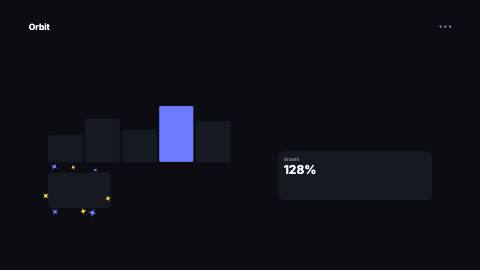
A ring of four-point star sparkles that pops out from a point, spins and fades, over a soft pulse ring.
SparkleBurst, badge
Installation
npx shadcn add https://www.reelcn.dev/r/sparkle-burst.jsonFiles land in src/reelcn/ with the items it builds on. Dependencies: remotion.
Usage
<Sequence from={20} durationInFrames={40}>
  <SparkleBurst origin={{ x: 72, y: 64 }} count={8} />
</Sequence>
Props
PropTypeDescription
delaynumberFrames to wait before entering.
durationnumberEnter duration in frames. Defaults to 0.6s. Some items reuse
duration for an unrelated local timing. See that item's own prop docs.exitnumber | booleanExit at the end of the parent `<Sequence>`.
false keeps it on screen, a number sets the exit length in frames.motionMotionPersonalityOverride the theme's motion personality.
posterbooleanRenders fully entered, with no exit: for a still frame or thumbnail. Defaults to
false.holdFramesnumberDelays the start of the exit window by this many frames, for a minimum on-screen hold. Defaults to
0.origin{ x: number; y: number; }Center of the burst in % of the canvas (0-100 on each axis). Default
{ x: 50, y: 50 }.countnumberNumber of sparkles. 6-12 reads best. Default
8.radiusnumberHow far the sparkles travel, in design units. Default
150.sizenumberLargest sparkle size in design units. Default
44.colorstringSparkle color. Defaults to the theme highlight.
secondaryColorstringEvery other sparkle, and the pulse ring. Defaults to the theme accent.
ringbooleanShow the expanding ring behind the sparkles. Default
true.seedstring | number Default
"sparkle".styleCSSProperties
classNamestring
Built from
Use
- Drawing the eye to a button, price or word the moment it appears
- A small "done" or "new" accent on a card
Avoid
- Full-screen celebrations. Use
confetti
Guides
Components take their colors from a theme, their timing from motion props and their layout from the canvas.
Source
registry/items/sparkle-burst.tsx
/**
 * @title Sparkle Burst
 * @category overlays
 * @description A ring of four-point star sparkles that pops out from a point, spins and fades, over a soft pulse ring.
 * @duration 27
 * @use Drawing the eye to a button, price or word the moment it appears
 * @use A small "done" or "new" accent on a card
 * @avoid Full-screen celebrations. Use `confetti`
 * @tags sparkle, star, twinkle, emphasis, accent
 * @example
 * <Sequence from={20} durationInFrames={40}>
 *   <SparkleBurst origin={{ x: 72, y: 64 }} count={8} />
 * </Sequence>
 */
import type React from "react";
import { AbsoluteFill, random } from "remotion";
import { type MotionProps, tween, useMotion, useTheme, useViewport } from "./core";

export type SparkleBurstProps = MotionProps & {
  /** Center of the burst in % of the canvas (0-100 on each axis). */
  origin?: { x: number; y: number };
  /** Number of sparkles. 6-12 reads best. */
  count?: number;
  /** How far the sparkles travel, in design units. */
  radius?: number;
  /** Largest sparkle size in design units. */
  size?: number;
  /** Sparkle color. Defaults to the theme highlight. */
  color?: string;
  /** Every other sparkle, and the pulse ring. Defaults to the theme accent. */
  secondaryColor?: string;
  /** Show the expanding ring behind the sparkles. */
  ring?: boolean;
  seed?: string | number;
  style?: React.CSSProperties;
  className?: string;
};

/** Four-point star in a 100 × 100 box: concave sides meeting in sharp tips. */
const STAR = "M50 0C53 35 65 47 100 50C65 53 53 65 50 100C47 65 35 53 0 50C35 47 47 35 50 0Z";

export function SparkleBurst({
  origin = { x: 50, y: 50 },
  count = 8,
  radius = 150,
  size = 44,
  color,
  secondaryColor,
  ring = true,
  seed = "sparkle",
  style,
  className,
  ...motion
}: SparkleBurstProps) {
  const theme = useTheme();
  const { u, width, height } = useViewport();
  const m = useMotion(motion);
  const primary = color ?? theme.colors.highlight;
  const secondary = secondaryColor ?? theme.colors.accent;
  const lifeFrames = Math.round(m.enterFrames * 1.5);
  const x0 = (origin.x / 100) * width;
  const y0 = (origin.y / 100) * height;
  const pulse = tween(m.frame, m.fps, { from: m.delay, duration: m.enterFrames, motion: "smooth" });
  const pulseSize = u(radius) * 1.3 * pulse;

  const sparkles = Array.from({ length: count }, (_, i) => {
    const r = (key: string) => random(`${seed}-${i}-${key}`);
    const start = m.delay + Math.floor(r("delay") * 4);
    const life = (m.frame - start) / lifeFrames;
    if (life <= 0 || life >= 1) return null;
    const out = Math.min(tween(m.frame, m.fps, { from: start, duration: m.enterFrames, motion: m.preset }), 1.15);
    const theta = ((i + (r("angle") - 0.5) * 0.7) / count) * Math.PI * 2 - Math.PI / 2;
    const distance = u(radius) * (0.55 + 0.45 * r("distance")) * out;
    // Pops to full size early in its life, then shrinks away.
    const s = u(size) * (0.45 + 0.55 * r("size")) * Math.sin(Math.PI * life ** 0.6);
    const turn = (i % 2 === 0 ? 1 : -1) * (30 + 60 * life) + (r("spin") - 0.5) * 40;
    return (
      <svg
        key={i}
        aria-hidden="true"
        viewBox="0 0 100 100"
        width={s}
        height={s}
        style={{
          position: "absolute",
          left: x0 + Math.cos(theta) * distance - s / 2,
          top: y0 + Math.sin(theta) * distance - s / 2,
          rotate: `${turn}deg`,
          overflow: "visible",
        }}
      >
        <path d={STAR} fill={i % 2 === 0 ? primary : secondary} />
      </svg>
    );
  });

  return (
    <AbsoluteFill className={className} style={{ pointerEvents: "none", opacity: 1 - m.exit, ...style }}>
      {ring && pulse > 0 && pulse < 1 && (
        <div
          style={{
            position: "absolute",
            left: x0 - pulseSize / 2,
            top: y0 - pulseSize / 2,
            width: pulseSize,
            height: pulseSize,
            borderRadius: "50%",
            border: `${u(3)}px solid ${secondary}`,
            opacity: (1 - pulse) * 0.7,
          }}
        />
      )}
      {sparkles}
    </AbsoluteFill>
  );
}